Friday, 4 November 2011

Week 4


1919
Bauhaus established in Weimar by Walter Gropius.
Freikorps assassinates the Spartacist leaders,


Bauhaus Graphic Design Introduction

-       These designs were knowsn as “New Typography”, no preferred style of type.
-       “We use all typefaces, type sizes, geometric forms, colours etc”- Laszlo Maholy-Nagy in 1923.
-       All attempts at the Bauhaus to design new letterforms were based on strict geometry, in a functionalist attempt tp shun Renaissance designs. "FRAKTUR" and heavy calligraphic typefaces. "Neuland" was designed by Rudolf Koch in 1924 and consisted of marks made a craft tool. Koch designed Cable in 1927, at the same time as the most popular san-serif type, "Futura"
-       The Bauhaus magazine began publication in 1926; this and the fourteen Bauhaus books were important vehicles for spreading ideas about arty theory and its application to architecture and design. Kandinsky, Klee, Gropius, Mondarian, Moholy-Nagy, and van Doesburg were editors or authors of volumes in the series.

Wednesday, 2 November 2011

Presentations

Over weeks 5 and 6, we did our presentations, which were all very interesting.
Ashley probably spoke for 25 minutes, but it was an interesting topic.

Looking at infographics

Over week 7 and 8 we looked at some infographic books, which were very intense, and pretty much impossible to read, but it did look good nonetheless.


We split into groups to come up with an infographic, and think of ideas on how we would present it. Blake, Richard and myself got together and surveyed the class 'anonymously' on their guilty pleasures. We had written a list for them, including 'Britney Spears", 'Justin Bieber', 'Beards', 'Singing in the shower', 'love stories' and so on, and then calculated how many ticks for each. We started thinking of doing the infographic with heaps of different doors representing the different guilty pleasures, and on each door, depending on how many ticks that particular one got, it would have that amount of 'locks' on the door, and if no one had selected one of the 'guilty pleasures' on the sheet, then the door would be open, as it doesn't seem to be much of a guilty pleasure.

Saturday, 29 October 2011

Typography Timeline

First 'completed' timeline without the two main typographers.

Second timeline with an attempt at the idea of using an image behind the 'clothesline of books'

This is the same as above, but wider to show more of the city/image.

This is also the same but enlarged the photo behind and move it up a bit.

After I had decided that the image wasn't working, I decided to try and draw in my own buildings and balconies to match the rest of the timeline. It still wasn't wide enough though because I had to somehow fit in the bigger books with the typographers and more information on each, on each building.

This is the final Typography Timeline, I had widened the buildings to add the 2 larger books with the information of 2 typographers, Matthew Carter and Hermann Zapf.

Monday, 24 October 2011

Week 11


Typography Infographic

At first, I had no idea what to do for the Typographic Infographic. I wanted to do something simple. I went from just wanted to do lines and curvy lines with the information, then I tried to work around whether books would work on a bookshelf, so then i combined both of the idea and made it into a type of clothes line that had books on it. Each book being a different typeface, with the name of the typeface, the designer and the year on the book. Then the idea was to have a hanging sheet of paper with a little more information on each typeface. I used soft colours on the books so it wouldnt be heaps dominant. I didn't do much of a 'key' for the infographic. I did however with the colours, if it was in the same year, I would continue with that specific colour until the year changes, but after I used a certain amount of colours I just lapped them again and used the same colours.

I got some suggestions that I should put buildings on either side to put emphasis on the 'clothes line'. I tried to find an image, but no image was large enough for my document and it took the attention away from the information and was too crowded. I then ended up just drawing in my own buildings and for the two main typographers I am doing 2 bigger books on either side of the buildings with more information on a larger 'piece of paper' coming from the book.

Presentation Photos

 Walter Crane, John Ruskin, William Morris


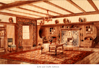
Arts and Crafts Movement

 
The Arts and Crafts Movement

The Arts and Crafts movement was developed in England in the late 19th century. It soon had been taken up by American designers, which cane with different results.

The Arts and Crafts movement had challenged the Victorian era greatly, with their style and tastes. “This movement was inspired by the social reform concerns of thinkers such as Walter Crane and John Ruskin, together with the ideals of reformer and designer, William Morris.” (http://char.txa.cornell.edu)

Crane, Ruskin and Morris all had a great idea of a good society, which brought them to have great design skills. They had a vision of a society in which the worker was not brutalized by the working conditions found in factories, but rather could take pride in his craftsmanship and skill.
“The rise of a consumer class coincided with the rise of manufactured consumer goods. In this period, manufactured goods were often poor in design and quality. Ruskin, Morris, and others proposed that it would be better for all if individual craftsmanship could be revived-- the worker could then produce beautiful objects that exhibited the result of fine craftsmanship, as opposed to the shoddy products of mass production. Thus the goal was to create design that was... " for the people and by the people, and a source of pleasure to the maker and the user." Workers could produce beautiful objects that would enhance the lives of ordinary people, and at the same time provide decent employment for the craftsman.”  (http://char.txa.cornell.edu)

“The British movement derived its philosophical underpinnings from two important sources: first, the designer A. W. N. Pugin (1812–1852), whose early writings promoting the Gothic Revival presaged English apprehension about industrialization, and second, theorist and art critic John Ruskin (1819–1900), who advocated medieval architecture as a model for honest craftsmanship and quality materials. Ruskin's persuasive rhetoric influenced the movement's figurehead (and ardent socialist) William Morris (1834–1896), who believed that industrialization alienated labor and created a dehumanizing distance between the designer and manufacturer. Morris strove to unite all the arts within the decoration of the home, emphasizing nature and simplicity of form.
The American Arts and Crafts movement was inextricably linked to the British movement and closely aligned with the work of William Morris and the second generation of architect-designers, including Charles Robert Ashbee (1863–1942), who toured the United States, and Charles Francis Annesley Voysey (1857–1941)”. (http://www.metmuseum.org/toah/hd/acam/hd_acam.htm)

Unlike in England, the undercurrent of socialism of the Arts and Crafts movement in the United States did not spread much beyond the formation of a few Utopian communities.
In urban centres, socialist experiments were undertaken on a community level, frequently in the form of educating young women. Ideas of craftwork and simplicity manifested themselves in decorative work, including the metalwork and pottery of the Arts and Crafts movement. Schools and training programs taught quality design, a cornerstone of the Arts and Crafts movement.


“The medieval crafts guilds were groups of artists, architects, and craftsmen who formed an alliance to maintain high standards of workmanship, regulate trade and competition, and protect the secrets of their crafts. The guilds were usually composed of smaller workshops of associated crafts from the same town who banded together into larger groups for their own protection and prosperity.” (http://www.artyfactory.com/art_appreciation/graphic_designers/william_morris/william_morris.html)
The members of the Arts and Crafts Movement formed themselves into crafts guilds, based on the medieval examples, in order to encourage high standards of design and provide a supportive working environment. They gave themselves names such as the Century Guild, the Guild of Saint George, the Art Workers Guild and the Guild of Handicraft. The Arts and Crafts Movement had also raised the status of design in art education and established it as an essential element in the manufacturing process.

 
This provided a model for the ideal craft production system. Aesthetic ideas were also borrowed from Medieval European and Islamic sources. Japanese ideas were also incorporated early Arts and Crafts forms. The forms of Arts and Crafts style were typically rectilinear and angular, with stylized decorative motifs reminiscent of medieval and Islamic design.
The Arts and Crafts Movement was a reaction against the poor quality of design during the Industrial Revolution and the members of the movement believed that the growth of industry had destroyed traditional skills and removed the pride that a craftsman could find in his work.
 
“Despite its high ideals, the Arts and Crafts Movement was essentially flawed. Their opposition to modern methods of production and the tendency to look back to the medieval world, rather than forward to a progressive era of complete mechanisation, was what eventually sounded the death knell of the movement. They could only fail in their socialist ideal of producing affordable quality hand-crafted design for the masses as the production costs of their designs were so high that they could only be purchased by the wealthy. Also, any movement which continually looks to the past for its inspiration must have a limited life span. There are only so many ways you can reinterpret the past without becoming repetitive.
However, the greatest legacy of the Arts and Crafts movement was their understanding of the relationship between design and our quality of life. This set the example for others who would later attempt to use the power of industrial mass production in the service of good design. “ (http://www.artyfactory.com/art_appreciation/graphic_designers/william_morris/william_morris.html)
 
William Morris was one of the Arts and Crafts Movement, and he was mainly known as a designer of patterns for wallpaper and textiles. William Morris was also an artist, designer, printer, typographer, bookbinder, craftsman, poet, writer and champion of socialist ideals, but although he is famous for his wallpaper designs, he also founded the Kelmscott Press which published high quality hand bound books and was very influential in the revival of the private press. Morris believed that the art and design of his own time was inferior and unworthy. He felt that this was due to the poor quality of life during the Industrial Revolution.
“Nature is the perfect example of God's design”- says Morris. He says this because he believes that all designs should be based on nature because he sees it as the spiritual remedy to the inferior standards of art and design during the Industrial Revolution.
The Arts and Crafts Movement raised the status of design in art education and established it as an essential element in the manufacturing process.
The Arts and Crafts movement influence other art movements such as the Bauhaus and Modernism, movements that believed in simplicity of design. Bauhaus and modernism believed in design and manufacture that the general public could afford. They also believed that simple functional designs should look good and be aesthetically pleasing. Manufactured products should be enjoyed for the way they looked and not only for their functional application.

Week 2

This week we all heard each others written manifestos.
I enjoyed listening to them, although a lot of them were harsh and some very witty.

I have noticed a lot of manifestos are very biased, but I do suppose that is the point of one. Most of them I have read are very in your face and 'this is how it is'.

Monday, 6 June 2011

Week 13

This week we just worked on and researched for our essays.
Which a few of us did in the library. I gathered background research on the designers i am writing, and collected photos of their work.

Wednesday, 1 June 2011

Week 11 and Week 10 mix up

I posted about week 11 earlier, and I got it mixed up with Week 10. So week 11 was actually week 10.
Week 11 is the week we watched the Helvetica movie.
It was an interesting movie, and after finishing the movie we went around to find everything that had helvetica typeface on it, and took photos with it.

Tuesday, 31 May 2011

Week 12

This week we watched 2 videos on designers, and then we started to discuss and plan what designers we are going to write about in our essays.
I decided on doing David Carson and Adrian Frutiger.

Week 11


Milton Glaser

Experimental Visual Language. Not sticking to the normal.
Speaks through and communicates through hidden elements of type and images.

He makes you think about his designs, and the meaning behind them.

A response where we go ‘wow, that is smart’

Bright colours
Colour coding


1945- 1985
Swiss/International

Late Modern
1945- 1970

Friday, 6 May 2011

Week 9

Due to Ruth being sick, class was not held this week.

Week 8

This week, I was not in class due to being very sick, so i had no participation this week.

Week 7

This week I came in to watch everyone else do their presentations, I really enjoyed it. It was very interesting. I liked Richard's presentation, it captured my attention and he presented really well.

Saturday, 9 April 2011

Week 6

This week, was our presentation week. I did my presentation on Paul Rand, and handed the report. I watched Ashley and Sam do theirs, and then I left due to being really sick. But i enjoyed watching the presentations!

Wednesday, 6 April 2011

Paul Rand

I changed my assessment to Paul Rand (Swiss International) because Ashley was already doing the person i started researching, here are a few of Paul's works.


Week 5

This week, we went to the Powerhouse Museum, which was fun. We had a look at everything inside. It was a good day, but the 80s was no longer running, but looked at some fashion, and what has been built etc.

Tuesday, 29 March 2011

Week 4


Today in class, we started studying  Art Deco (1925- 1940).
The term “art deco” was derived from the “Exposition Internationale des Arts Decoratifs et Industrial Modernes” which was held in Paris in 1925.

Art Deco visual motifs include geometric shapes, curves, Egyptian zigzags, sunbursts, lightning bolts, airbrushed ray bands, motion lines, aerodynamic and streamlined forms. Some examples are:


The second half of the class we split into two groups, and played a game, based on the visual motifs we see in every image. It became pretty competitive, but a great learning style.

Friday, 18 March 2011

David Carson Research- The Digital Age


I have been researching for the last week on the assessment we are doing, and I have chosen to do David Carson (The Digital Age). One look at his designs, and I couldn’t turn back. I really love them, and it has been great exploring some of his work!
A few of my favourites I have discovered so far are as follows:


David Carson is an American Graphic Designer, born September 8, 1952. He is best known for his innovative magazine design and use of experimental typography. David Carson has been one of the greatest influences on modern graphic design in the last 25 years. He took both photography and type, manipulated and twisted them together.

He was the first to mix and match funky off-beat type faces with traditional ones in order to add texture and diversity into his work. His typographic experimentations have been admired by recent generations for their rebellious messiness that closely imitated the social scene of the 1990s.

Here are a few other designs of his I have collected: